Cognitive Overload
Users are intimidated by complex chemical names and don't know if they are harmful or beneficial.
Mobile Application
An AI-powered app that scans products, analyzes their ingredients, and identifies harmful or beneficial chemicals based on personal health data.
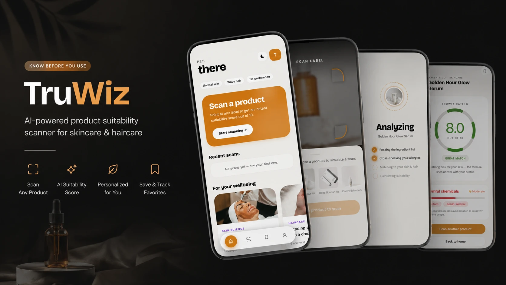
Consumers struggle to understand the ingredients and chemical composition of everyday products. Without clear information, they cannot easily identify harmful substances or determine whether a product is suitable for their personal health needs.
An AI-powered mobile app that scans product labels to instantly highlight harmful or beneficial ingredients. It provides personalized suitability insights based on the user’s health profile, allergies, and preferences.
It started when a friend and I were struggling to find the right skincare products. We realized that even though we could upload photos to ChatGPT for ingredient checks, it was too many steps. We wanted something smoother—an app that tells you if a product suits your skin type and keeps a history. That’s where this concept came from.
While ingredient analysis tools exist (Google, Yuka, ChatGPT), they fail in two key areas: context and speed.
Users are intimidated by complex chemical names and don't know if they are harmful or beneficial.
Most scanners give a generic "Good/Bad" rating but fail to account for specific allergies or skin types.
Users struggled to remember which products they had previously scanned or why they rejected them.
I analyzed the current workflow of using ChatGPT for ingredient checking:
Current Workflow (6+ Steps)
Open Camera → Take Photo → Open App → Upload → Type Prompt → Wait.
Opportunity (2 Steps)
Open App → Scan.
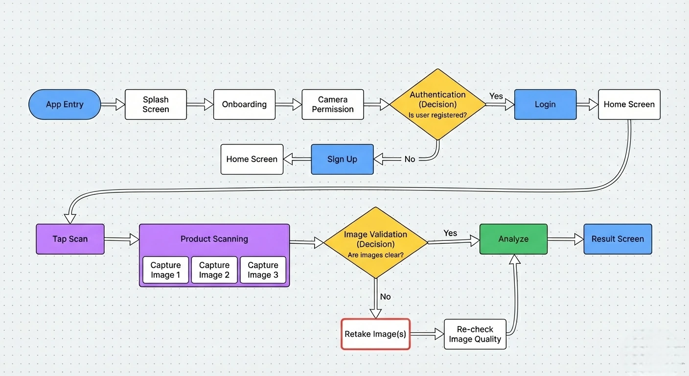
The end-to-end path from first launch to a suitability result, including the image-quality check that sends a blurry scan back for a retake.
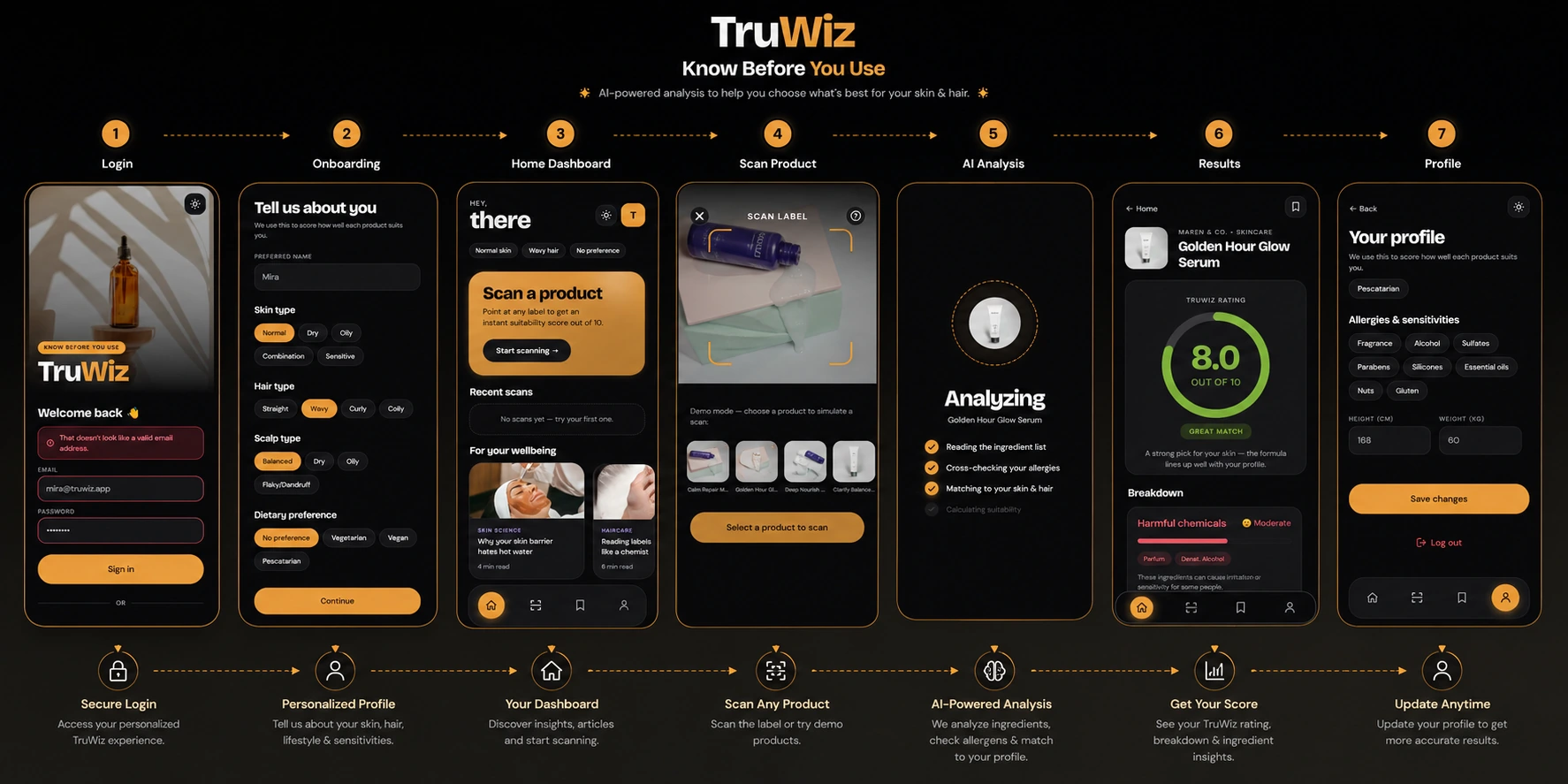
The seven screens that carry a user from sign-in to a scored result: profile setup that captures skin, hair and sensitivities, the scan itself, the analysis pass, and the breakdown behind the rating.
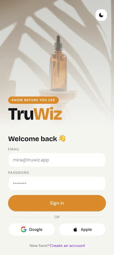
Login
Sign in, with social options for a faster start.
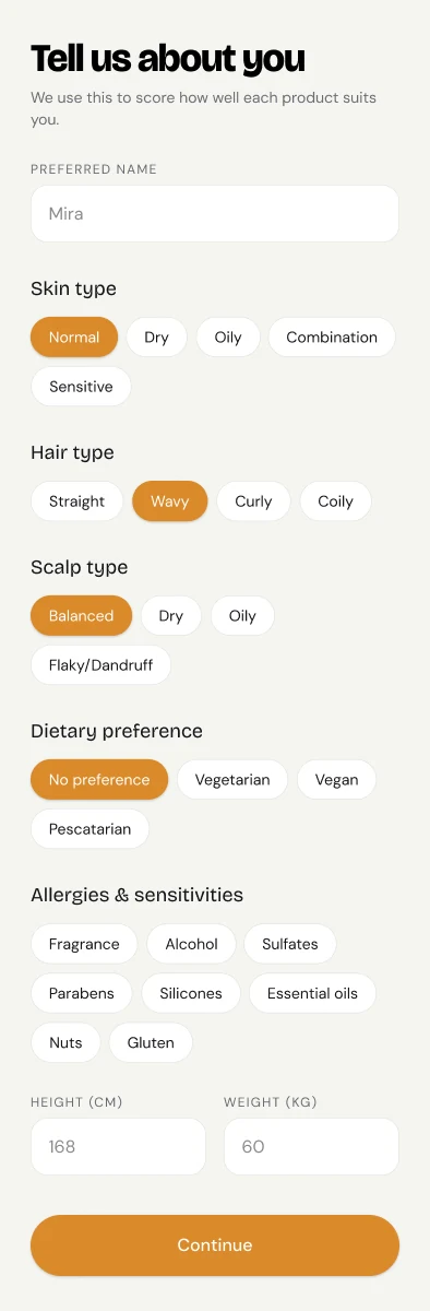
Onboarding
Skin, hair, scalp, diet and sensitivities — the profile every score is measured against.
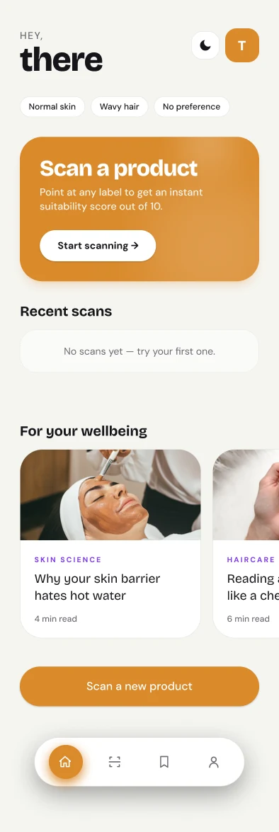
Home
Scan entry point, recent scans and short reads.
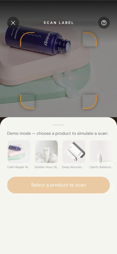
Scan label
Camera framing with a demo mode for testing.
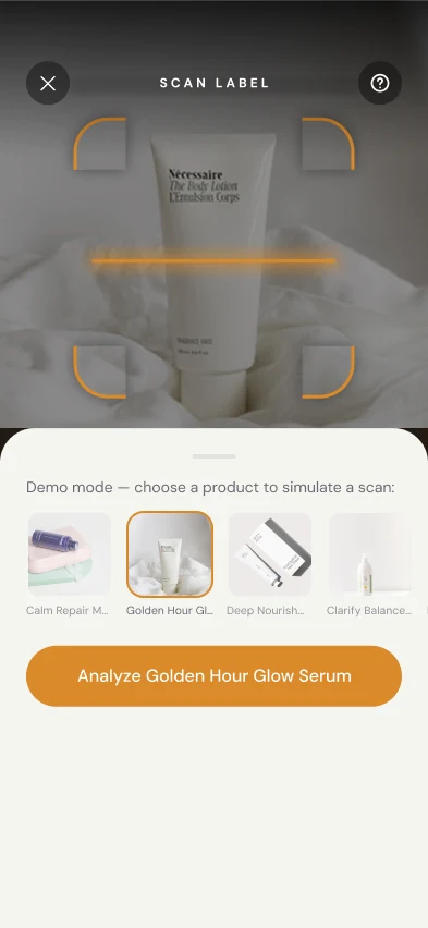
Product selected
Confirmation before analysis begins.
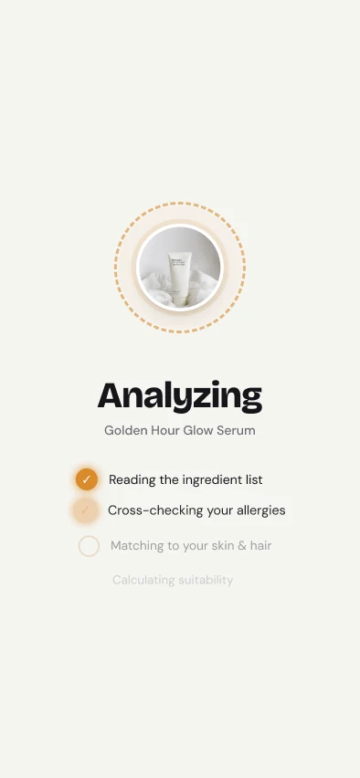
Analyzing
Each check named as it runs, so the score never feels like a black box.
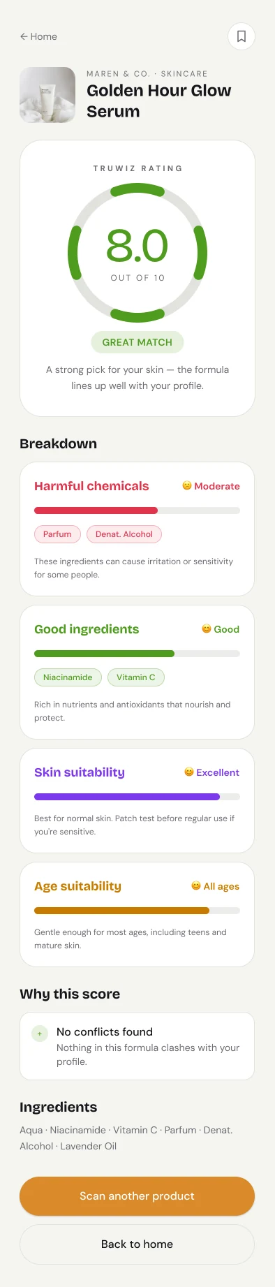
Result
Score out of 10, then the breakdown behind it — harmful ingredients, good ones, skin and age fit.
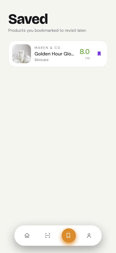
Saved
Bookmarked products to revisit.
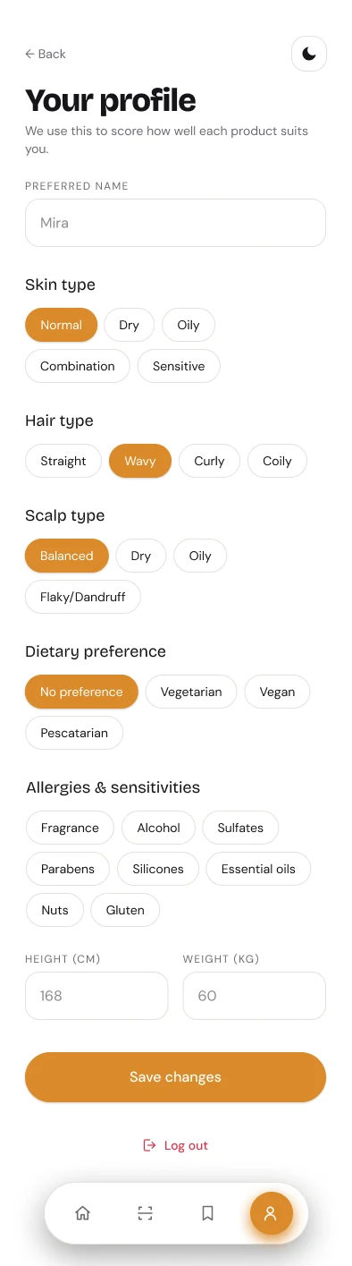
Profile
Edit the profile and rescore future scans.
To validate the early design, I conducted lightweight usability testing with 3 participants. Each was asked to scan a real product and explain their decision-making process.
Replaced technical terms with plain-language summaries.
Introduced color-coded badges (Safe, Caution, Avoid) for quick scanning.
Refined button hierarchy to make the "Next Step" obvious.
Evaluating effectiveness based on speed, clarity, and confidence.
Significantly reduced by eliminating manual research.
From 6+ steps (ChatGPT method) down to 2 steps.
Visual indicators improved trust in decision making.
Scan history encouraged long-term value.
Enable barcode scanning for faster ID of packaged goods.
Flag ingredients restricted in specific countries.
Compare two products side-by-side for safety scores.
Premium feature with medically verified insights.