UX/UI Case Study

SnapE Cabs, rethought

Redesigning the key flows of an EV ride-booking app to improve usability, visual clarity, and user trust.

Role
UX/UI Designer
Timeline
4 Weeks
Platform
Mobile App — iOS & Android
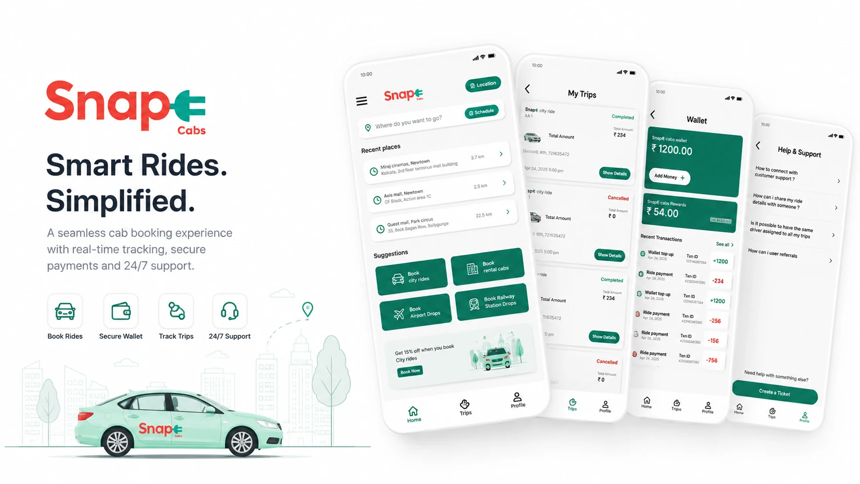
SnapE Cabs — smart rides simplified, project cover

The problem

The app carried an outdated interface, a confusing navigational hierarchy, and far too much cognitive load for core tasks. Booking a ride, managing the wallet, and reaching support all felt heavier than they should — a sharp disconnect between a premium physical EV service and its digital counterpart.

The solution

A structural and visual redesign built around frictionless usability: a modernized design system, tighter spatial layout, features grouped by intent, and high-value shortcuts such as saved places. The booking experience should be as quiet and smooth as the ride itself.

Context & research

What is SnapE Cabs?

An electric-vehicle cab service operating primarily in Kolkata. Drivers are salaried, which means zero cancellations, no surge pricing, and cleaner travel.

User interviews

  • Daily drivers navigating routes
  • Frequent, reliant commuters
  • Frustrated first-time users

Core friction points

  • Hidden primary actions
  • Laggy, multi-step flows
  • Broken visual hierarchy

Method

  • Flow audit of the live app
  • 8 moderated usability sessions
  • Task timing on core journeys

Design approach

Screen by screen, each change answers a specific pain point.

A self-initiated redesign concept — not affiliated with, or commissioned by, SnapE Cabs. The “before” screens are from the live app at the time of the study.

01

Streamlined navigation

Reduce cognitive load and improve accessibility.

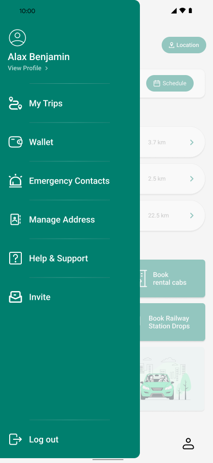
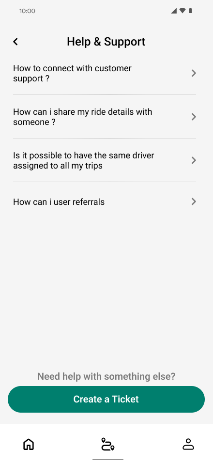
Increased touch targets, consolidated FAQ and Help Center into a single support hub, and established a consistent typographic scale across the app.

Before
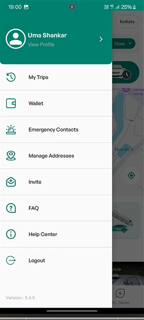
Original SnapE Cabs navigation drawer with nine stacked menu items

After

Redesigned SnapE Cabs side navigation menu

The original drawer stacked nine destinations at small touch targets, with FAQ and Help Center listed as two separate entries.

Before
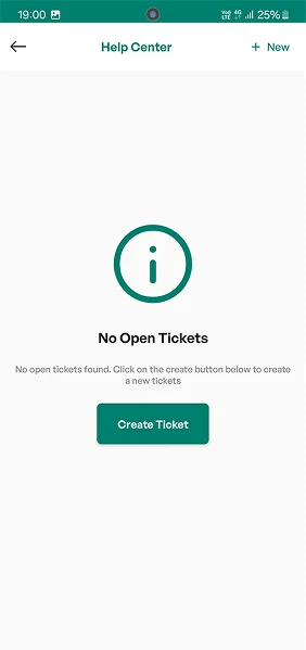
Original SnapE Cabs Help Center showing an empty-ticket state

After

Consolidated Help & Support screen with ticket creation

The original Help Center opened on an empty state — no tickets, no FAQs, and no route to an answer without first creating a ticket. FAQs lived on a separate screen entirely.
02

An intelligent home screen

Smarter inputs, cleaner hierarchy.

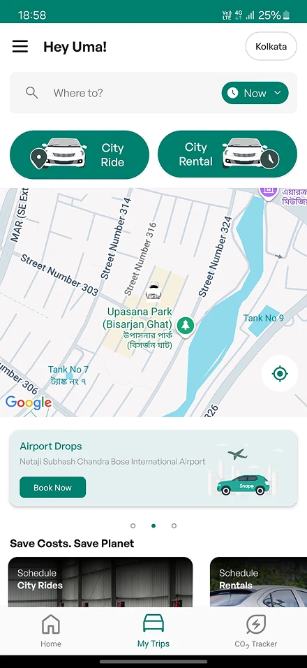
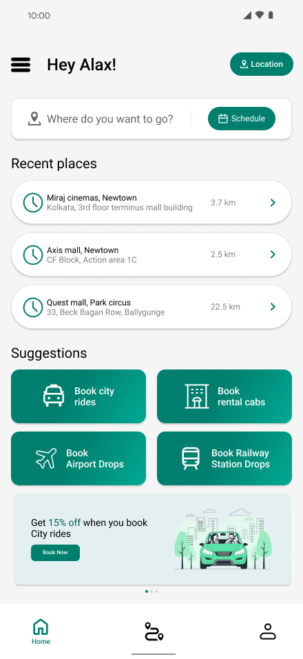
Replaced the generic search bar with a predictive input that surfaces recent locations, and moved offers into a grid below the fold so they never crowd the booking flow.

Before

Original SnapE Cabs home screen with a large embedded map

After

Redesigned SnapE Cabs home screen with recent places

A third of the original home screen went to a map that did not help you book, pushing recent places below it.

03

Ride booking flow

Flexibility and clear guidance.

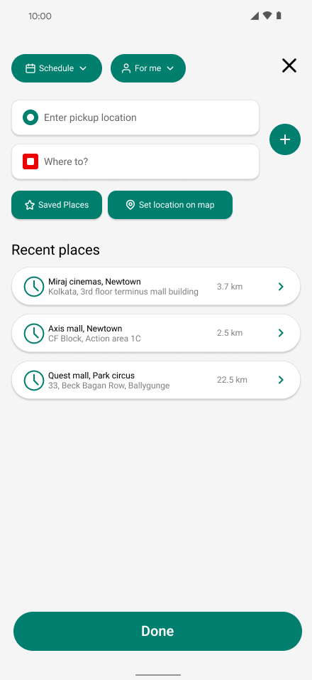
Introduced a Schedule Ride option and suggested recent destinations up front, which measurably shortened time-to-book.

Before

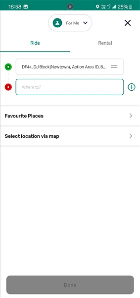
Original SnapE Cabs booking sheet with an empty destination field and a disabled Done button

After

Location entry screen with schedule and saved places

The original sheet opened on an empty destination field with no recent or suggested places, and the Done button stayed disabled until you typed one in — leaving most of the screen blank at the moment of highest intent.

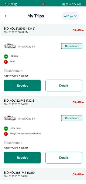
Before

Original SnapE Cabs My Trips list with booking IDs shown first

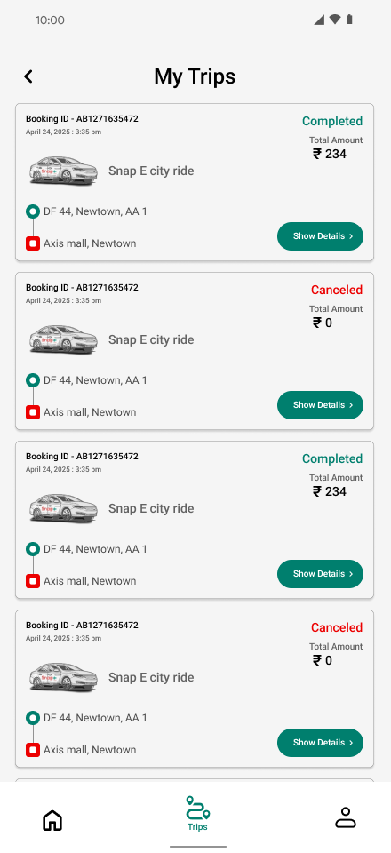
After

My Trips list showing ride status and fares

Each original trip led with a booking ID rather than the journey, and gave Receipt and Details equal visual weight — so scanning your ride history meant reading past the reference numbers first.

04

Transparent wallet

Build trust through financial clarity.

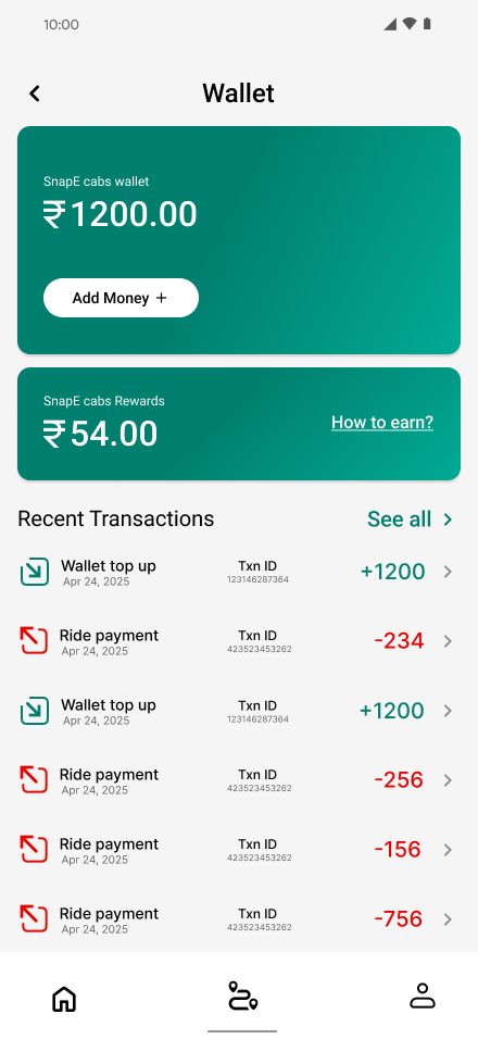
Detailed transaction logs with clear iconography and timestamps, plus reward mechanics explained in plain language with accessible guides.

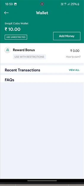
Before

Original SnapE Cabs wallet screen with empty transaction and FAQ sections

After

Wallet screen with balance, rewards and transaction log

The original wallet showed a balance and two collapsed headings — Recent Transactions and FAQs sat empty with nothing beneath them.

Testing & results

Validated with 8 users across the core flows.

6/8

Users reported a clear improvement in wallet clarity.

100%

Task success rate for finding and creating a support ticket.

40%

Average reduction in time-on-task for wallet top-ups.

Conclusion

By prioritizing functional clarity and aligning the interface with modern standards, the redesign turns the SnapE Cabs app from a point of friction into an extension of the premium service itself — simpler navigation, faster core actions, more trust.